Some Information about CSS
CSS (Cascading Style Sheets) is the language used for styling web pages. It should also be used for page layout, which may or may not be viewed as a somewhat different usage from that of styling.
See these sample files for illustrations of many of the concepts summarized here, and more.
Hakon Wium Lie and Bert Bos are generally credited with getting the CSS band wagon rolling, and now virtually the entire web community is on board. A very simplified/condensed version of the development timeline looks something like this:
CSS 1 -> CSS 2 -> CSS 2.1 -> CSS 3 (modular rather than monolithic)
1996     1998      2011     current
Actually, CSS 2.1 appeared as a W3C candidate recommendation in 2004, was withdrawn in 2005, and put out again in 2007, but not finally approved till 2011. Because CSS 2.1 was a large, "monolithic" standard, and because there were so many problems getting that standard approved, CSS 3 has been "modularized", so that various parts of the standard can be dealt with independently.
Style rules can be placed in these locations:
The following is an example of a simple "style rule":
h1 {color: blue;}
And a slightly more complicated one:
h1 {color: blue; font-size: 16px;}
The general syntax (with terminology) is this:
selector {property1: value1; property2: value2; ...}
Or, more succinctly:
selector {declaration1; declaration2; ...}
Or, even more succinctly:
selector {declaration-block}
s1, s2 {declaration-block}
Grouped Selectors (comma-separated list) Here the style(s) in
declaration-block apply to both selectors,
s1 and s2. This is the meaning of a
comma-separated list of selectors.
s1 s2 {declaration-block}
Descendant Selectors (whitespace-separated list) Here the
style(s) in declaration-block will apply to element
s2 only if it is a descendant of (is nested inside) element
s1. This is the meaning of a whitespace-separated list of
selectors.
s1 > s2 {declaration-block}
Direct Child Selector Here the style(s) in
declaration-block will apply to element s2 only
if it is a child of (is nested immediately inside) element
s1. Note that this is a more specific form of
"descendant".
s1 + s2 {declaration-block}
Adjacent Sibling Selector Here the style(s) in
declaration-block will apply to element s2 only
if it is an adjacent sibling of element s1. That is,
s1 and s2 must be adjacent elements with the same
parent.
class and idTwo of the core attributes of XHTML (attributes that can be
applied to any XHTML element) are class and
id. It is important to remember that the value of any
id attribute must be unique on a web page, since (as its
name suggests) its main function is to identify, for purposes of styling
via CSS or manipulation by JavaScript, a unique page element. The value of
a class attribute, by contrast, may appear as many times as
you like on a given web page. This too makes perfect sense, since you may
well want many different elements to share the same "class of
styles".
Here are the syntax details for class and id
selectors:
.ClassName {declaration-block}ClassName, which can then be used to style
any XHTML element e like this:<e class="ClassName"> ... </e>s.ClassName {declaration-block}ClassName to
selectors of whatever type the selector s is.#idName {declaration-block}id attribute with value
idName.<e id="idName"> ... </e>s#idName {declaration-block}id value idName
must be an element of type s.class and id
Selectors<e class="Class1 Class2"> ... </e>id refers to the
value of the id attribute in an XHTML document.
There can be as many references to that id value as you
need within the CSS document where it is defined.There is only one form of comment in CSS, and it works for either
single-line comments or multi-line comments:
/* text of comment */
Here are some CSS "best practices" regarding comments:
/* filename.css *//* filename.css Brief description of file content may go here ... */
/* ===== header styles ===== */To conserve vertical space, format style rules in an external style file or in a document-level style element as illustrated in one of these (very simple) examples, in which we have chosen an (adequate) indentation level of 2 spaces, but you may wish to increase this value:
selector {
property1: value1;
property2: value2;
}

selector {
  property1: value1;
  property2: value2;
}

selector1, selector2 {
  property1: value1;
  property2: value2;
}

selector1,
selector2 {
  property1: value1;
  property2: value2;
}
Whatever style you choose, be consistent with its use.
Units of measurement are generally used on the web for quantities like width, height, length, and font-size. A percentage measurement is relative to something that depends on what is being measured, so it might be relative to the current font size, for example, or relative to the width of the parent element.
mm cm (millimeters or centimeters)in (inches)pt pc (points or picas)
(72pt=1in, 12pt=1pc)px (pixel, a unit of screen real estate, which
depends on screen resolution)em (1em = current font size)ex (height of a lowercase x in the
current font size, about .5em)% (percentage relative to something
context-dependent)Much more detailed information on CSS 2.1 properties and their values can be found here.
| aqua | gray (or grey) | navy | silver |
| black | green | olive | teal |
| blue | lime | purple | white |
| fuchsia | maroon | red | yellow |
rgb(0,127,255)rgb(0%, 50%,
100%)#A1B2C3
#AA22EE#A2E (same as
#AA22EE)00 33 66 99 CC FF6633FF C09Fonts are determined by the following properties:
font-style:
normal|italic|obliquefont-variant:
normal|small-capsfont-weight:
normal|bold|bolder|lighter|100|...|900font-size/line-height:normal|number|length|percentagefont-family: font1, font2, ..., generic-fontserif (Examples: Georgia,
Times, "Times New Roman")sans-serif (Examples: Verdana,
Arial, Helvetica)monospace (Examples: Courier,
"Courier New", "Lucida Console")cursive (Examples: Zapf-Chancery)fantasy (Examples: Critter,
Western)One of the system font keywords for the value of the
font-family property is something you might want to consider
if you want the font of some element to mimic the appearance of some
particular (platform-dependent) font that is used for display purposes on
a given system. Here are the available options:
font-family:
caption|icon|menu|message-box|small-caption|status-bar
Backgrounds are determined by the following properties:
background-color:
color-value|transparentbackground-image:
url(path/name.ext)|nonebackground-repeat:
repeat|repeat-x|repeat-y|no-repeatbackground-attachment:
scroll|fixedbackground-position: horizontal-position
vertical-positionCSS permits a number of style properties to be written in "shorthand"
form. These include the font and background
properties shown above, and the padding, border
and margin properties discussed below. The shorthand forms
of these last three properties are illustrated in generic form in the
following section on the CSS "box model", and more concretely in some of
the examples in the sample files. The font and
background shorthands are also illustrated in the sample
files.
url("path/file.ext") (which might appear as a value of the
background-image property, for example) are optional.px
or em, with some exceptions. For example, in a table the
border, cellspacing and
cellpadding attributes can only take pixel values, so
px does not have to be supplied.
Interestingly, experimentation shows that if you do supply
px in the case of cellpadding, Tidy will
flag a warning, while the W3C validator will not complain. If you do
the same with border, Tidy will not complain, and again
neither will the validator. In any case, the browser appears to
simply use the numerical value and assume the unit to be pixels.
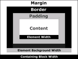
Every element on a web pages is contained in a "box", consisting of the "content" of the box, which may be surrounded by any, all, or none of "padding", a "border", and a "margin". It is therefore important to understand this CSS box model to fully appreciate how CSS works. Here is an excellent diagram (downloaded from the web) illustrating the four parts of the basic structure of the CSS box model:
Quite often an element will have only content, or only content at least as far as the web developer is concerned. A browser may, however, supply its own (default) values for the other "box properties", particularly padding and/or margins.
Content Typically, for the (innermost) "content" portion of the box model you might wish to style the foreground (text) color, the background and the font. Here are the generic "shorthand" forms of each of these properties:
background: background-color background-image
background-repeat background-attachment background-positioncolor: some-specific-colorfont: font-style font-variant font-weight
font-size/line-height font-familyPadding The padding portion of the CSS box model encloses the
content portion and its width may be specified separately on each of the
four sides using the padding-top,
padding-right, padding-bottom and/or
padding-left properties. That width may be specified using
any of the CSS measurement units. There are also four "shorthand" ways to
specify padding, as suggested by the following:
padding: 20px 15px  10px   5px;
         top  right bottom left
         ----------------------
         20px     10px     5px;
         top   left/right  bottom
         ------------------------
         20px        10px;
         top/bottom  left/right
         ------------------------
         20px;
         all
Border The border portion of the CSS box model lies between the
padding and the margin and, like both of them, its width may be specified
separately on each of the four sides using the usual units and the
border-top-width, border-right-width,
border-bottom-width and/or border-left-width
properties. Borders, unlike padding and margins, have (potentially) a
couple of other properties (color and style), in addition to width, that
are often applied, and which permit a wider selection of shorthand
properties. However, the most general of these shorthand properties looks
like this:
border: width-value style-value color-valueNotes on the border property:
Margin The margin portion of the CSS box model is the outermost
portion and, like padding, its width may be specified separately on each
of the four sides using the margin-top,
margin-right, margin-bottom and/or
margin-left properties. As with padding, that width may be
specified using any of the CSS measurement units, but unlike padding,
negative margin values are possible. The keyword auto may
also be used as a margin value. And again, as with padding, there are
four "shorthand" ways to specify margins, analogous to those shown for
padding above.
width attribute or the
height attribute is supplied for an element, the values
apply only to the content portion of that element. So, for
example, to compute the total width occupied by an element on a web
page, you must add the width of the element (which just gives you the
width of the content) to the widths of the padding, borders and margins
on both sides.background attribute of an
element extends under the content, the padding and the border of the
element, but not under the margin of that element.In addition to styling elements, another major use of CSS is for layout, that is, the positioning of elements on the web page.
position: static; is the default, and corresponds to
normal flow.position: relative; leaves an element in normal flow,
but
position: absolute; removes an element from normal flow,
and ...
position: fixed; is like absolute positioning, but ...
z-index: #; establishes the "stacking level" of an
element (along an axis perpendicular to the display area), and ...
float: left|right;
clear: left|right|both; specifies on which side(s) of
floating element other elements not allowedBecause the styles that are supposed to apply to a particular document may have been defined by several different people and may come from several different physical sources, these styles will often "compete" and find themselves in a "conflict of interest" situation with respect to a given element. For this reason, there needs to be some algorithm that a browser can use to determine which of several conflicting styles that all apply to the same element will actually be applied when the document containing that element is displayed in the browser's window. Several different factors come into play when a browser is making these decisions, including "inheritance", the "specificity" of the element in question, and a process called the "cascade" (from which comes the term "Cascading Style Sheets"). Thus, in summary, the cascade is the mechanism by which a conflict caused by multiple styles applying to the same selector is resolved.
Inheritance is the mechanism by which the styles of a parent or ancestor element are passed along to a child or descendant element. And perhaps one of the first things to remember about the style of an element is that many style properties are "inherited". This means that a child or other descendant element (that is, a nested element) will often, but not always, simply "inherit" (receive) its styles from its parent element (or, more generally, from its ancestor elements), unless these inherited styles are overridden at the lower level.
In general, text-related properties are inherited, but box-related
properties are not inherited.Among the style properties that are
not inherited (at least not by default, and forced inheritance
using the keyword inherit does not yet appear to be widely
supported) are those in the following categories:
Any given element of a document may potentially be subject to any or all of of the following:
style element placed within the
head element of the document itselfstyle attribute placed within the
opening tag of an element in the document itselfThe term "specificity" refers to how "specific" a particular selector is, and it also refers to a method of calculating the amount of "weight" a browser will give to a given style rule, based on the number of selectors and other entities that appear in that rule.
The specificity of a selector is a 4-digit number abcd
formed by concatenating the following four values:
a = 1 if the selector has an inline style attached, 0
otherwiseb = # of id attributes attached to the
selectorc = # of classes, pseudo-classes and other attributes
attached to the selectord = # of element names in the selectorThese examples contain only three of the four possible digits, assuming that no inline styles are involved.
| selector | specificity |
|---|---|
h1 |
001 |
em |
001 |
p img |
002 |
#option li |
101 |
h1.blue |
011 |
To perform a "cascade" of styles that apply to a given element, the browser performs the following steps, in the order shown:
Any style can be given an "important" designation via the
!important mechanism. Here is an example illustrating the
syntax:
h4 {color: blue !important;}
And here is the "official cascading order" for all of these different style sheet origins (from "most important" to "least important") :
Note that for "normal" styles author takes precedence over user. But
when !important is applied, this is turned around. That is
!important user styles take precedence over corresponding
!important author styles.
In the list below, read ">>" as "takes precedence
over":
To make the cascade work consistently, place the link to an external style sheet before any embedded style sheet in the document header, and only use an inline style if it is absolutely necessary. This allows a wide range of common styles to be applied to most or all pages on a website, with document-level overriding styles placed in the document header and element-level overriding styles to be placed in the element.
*) and
@importConsider using a "CSS reset". This is a group of styles that set a number properties for which browsers would use their (possibly not uniform) defaults to "baseline values", after which the web designer's desired values can be assigned. That way, the designer knows what he or she is going to get when the page is displayed.
The universal selector *, which means "everything" can be
used when setting up a CSS reset, but it too is one of those things that
has a bad reputation for not being implemented properly across
browsers.
The @import mechanism can be used to "import" one style
sheet into another. If used, it should be the first line of the file into
which you want the external file of style imported. Here is the
syntax:
@import external_file.css
class="Class1 Class2"@import can be used within a style element as well as
from an external file, and in both cases should be the first thing to
appear, but note that it can also slow download speed.visibility: hidden property an element
retains its place in the flow; not so with display:
none.top,
bottom, left and right properties
for relatively positioned elements vs. absolutely positioned elements.
Also be aware that these properties have no effect on an element with
position: static (the default).head tag
or just before the script element if there is one, since the script
element should then itself be just before the closing head
tag.id and class names are
case-sensitive.img element, and except for left and right
margins.width of the containing element, not its
height.